University of Cumbria – A brand enriched
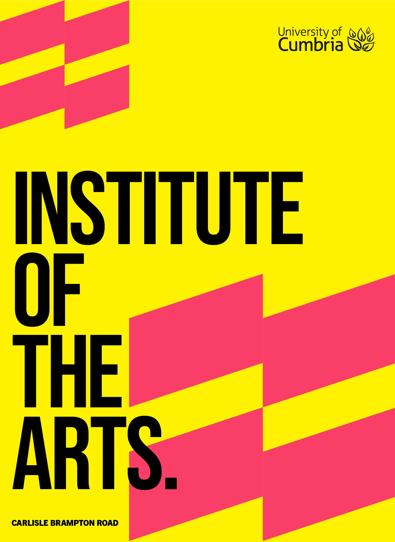
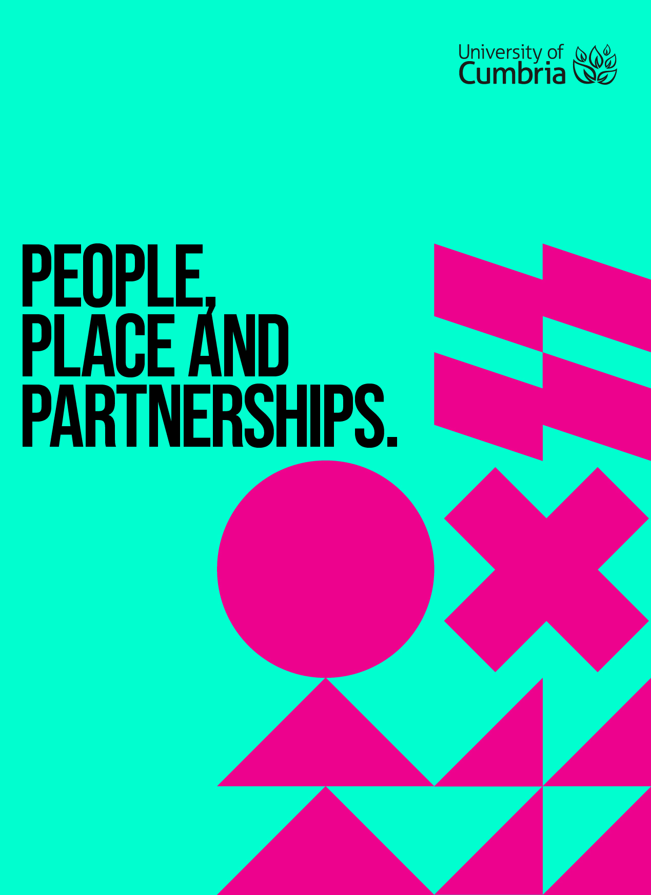
The University of Cumbria required a refresh of their brand. They had existing simple graphic device shapes that represented each of their campuses and the challenge they were having was how to utilise all of these graphics and have the ability to mix them together, whilst really dialling up their branding to be simpler to use, braver, bolder and more impactful.
Spread over 6 campuses – the University needed a clear colour and visual hierarchy that gave each of these its own style as well as the ability to mix for multi-campus pieces.
The brand idea — Being. Enriched. People are at the heart of what UoC do. They evolve people to grow and enrich their lives. This formed the basis for the branding.
A bright, digital first palette was adopted using light and darks (base and accents). Allowing for the colours to be built upon when combined with shapes, photography and typography – creating striking layouts.
A duotone image treatment along with two new fonts was introduced – adding more colour, vibrancy and impact.
The key thing was making the brand accessible to all levels of user – from faculty to their in-house design teams. So different templates were developed from functional to expressive.